Home | Studio Work | Athletic Identity | Ceramics | Gallery | Contact

Artwork By Phil Kennedy

St. Olaf Soccer T-shirts

How it was done

I was chosen to design the t-shirts for the soccer team this year. I had never done a 100% digital project so I improvised...


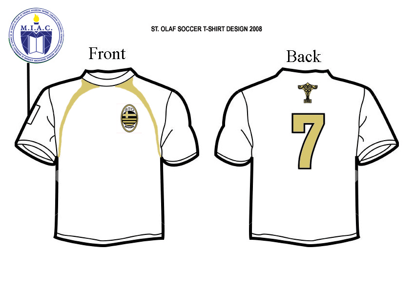
I pretty much googled all of my source material then changed it in photoshop. I found a nice t-shirt template.
 

number_7.jpg

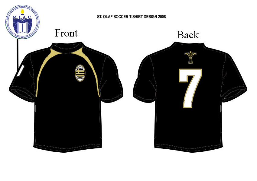
I used AC milan as a source for our logo


Basically just changed the colors and text, then rotated the circle in the center. Then I moved the cross to the side to make it look like the Norwegian flag.


black_rgb.jpg

white_rgb.jpg


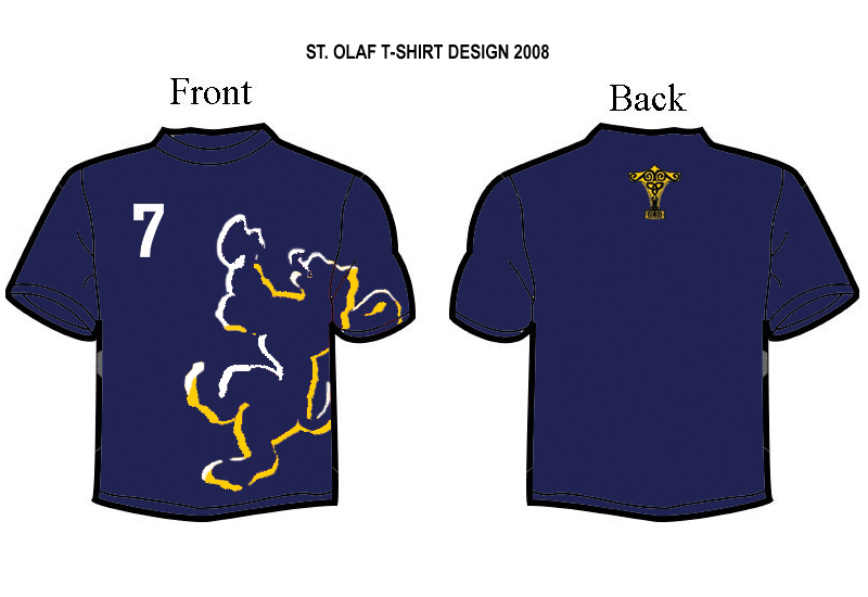
The second t-shirt was a less "formal" design on regular cotton. I started with the red, white, and blue as a norwegian color scheme.


The progression turned the lion to an outline


The final color scheme came from the captain's nike hat he always wears.


So here's what we ended up with:

template.jpg


I used a Ben Roethlisberger collectible for the number 7.


ac_milan_logo.jpg

sto_logo2.jpg


Added the MIAC logo (our conference) to the sleeve and pieced it all together. The hammer I got from the coach and again changed the colors.


We ended up going with the white version. It was screen printed on a higher quality "dri-fit" material.


red_shirt_bluewht_full.jpg

red_shirt_bluewht_outline.jpg

blu_final_rgb.jpg

white_rgb.jpg

blu_final_rgb.jpg